Luméa – brand identity and packaging design case study
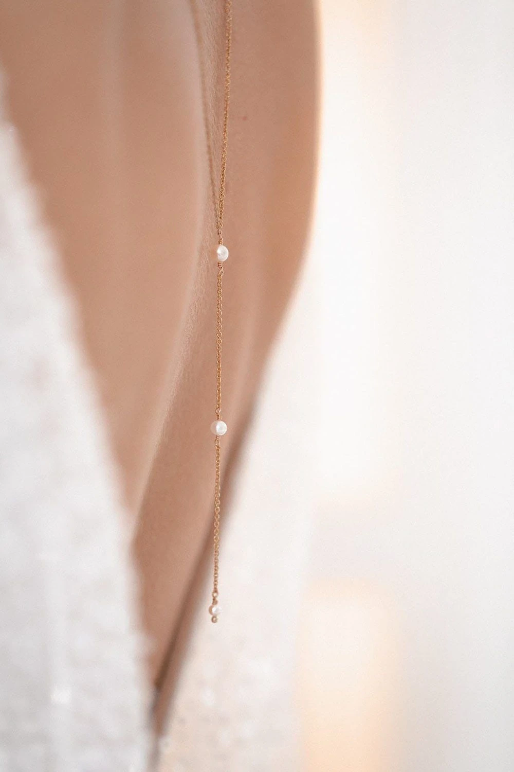
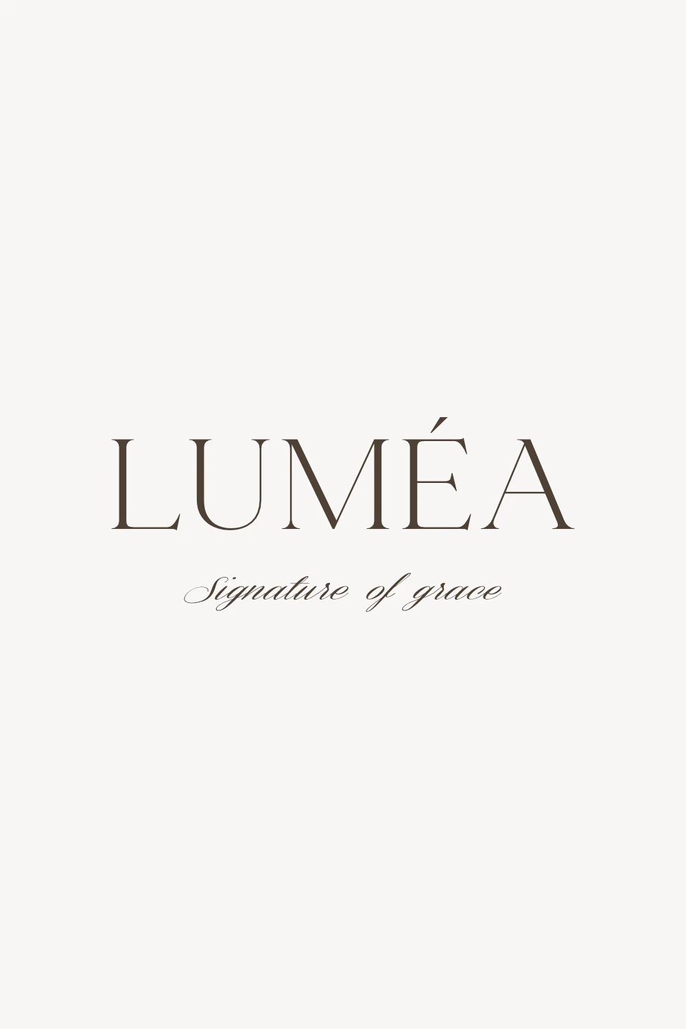
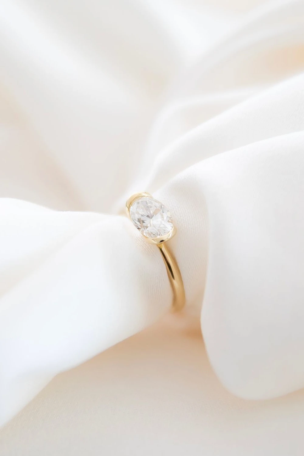
Luméa is a self-initiated jewelry brand concept shaped by understated elegance, refined simplicity, and a quiet approach to luxury. Created for women who value aesthetics, quality, and timeless design, the brand is positioned between everyday jewelry and accessible luxury.
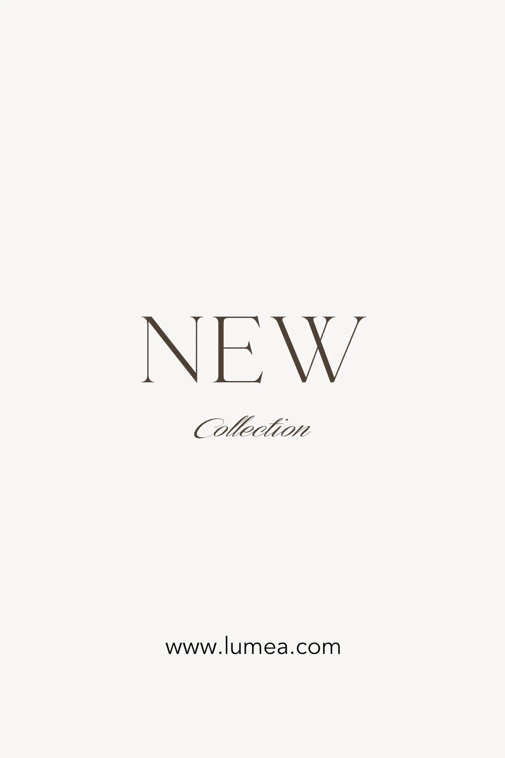
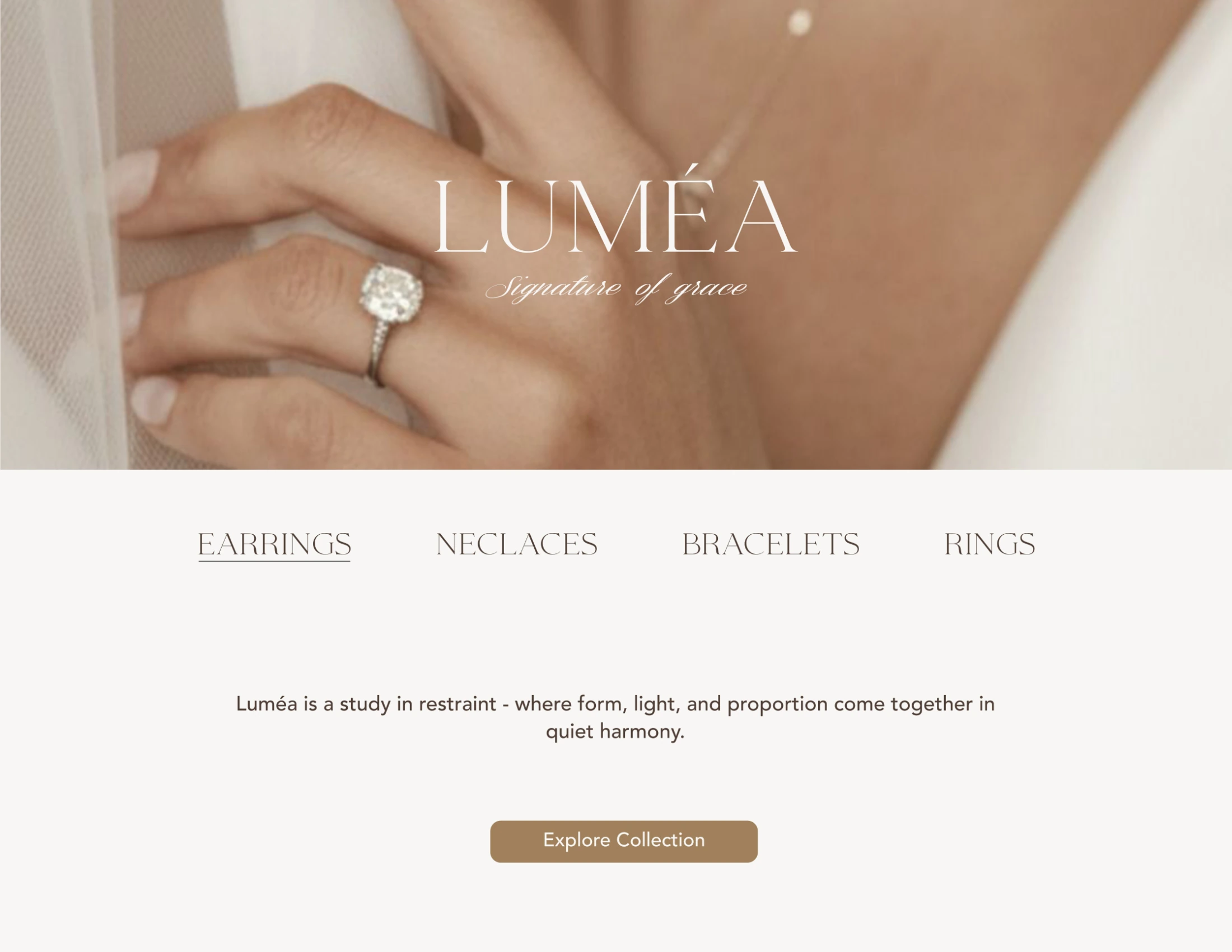
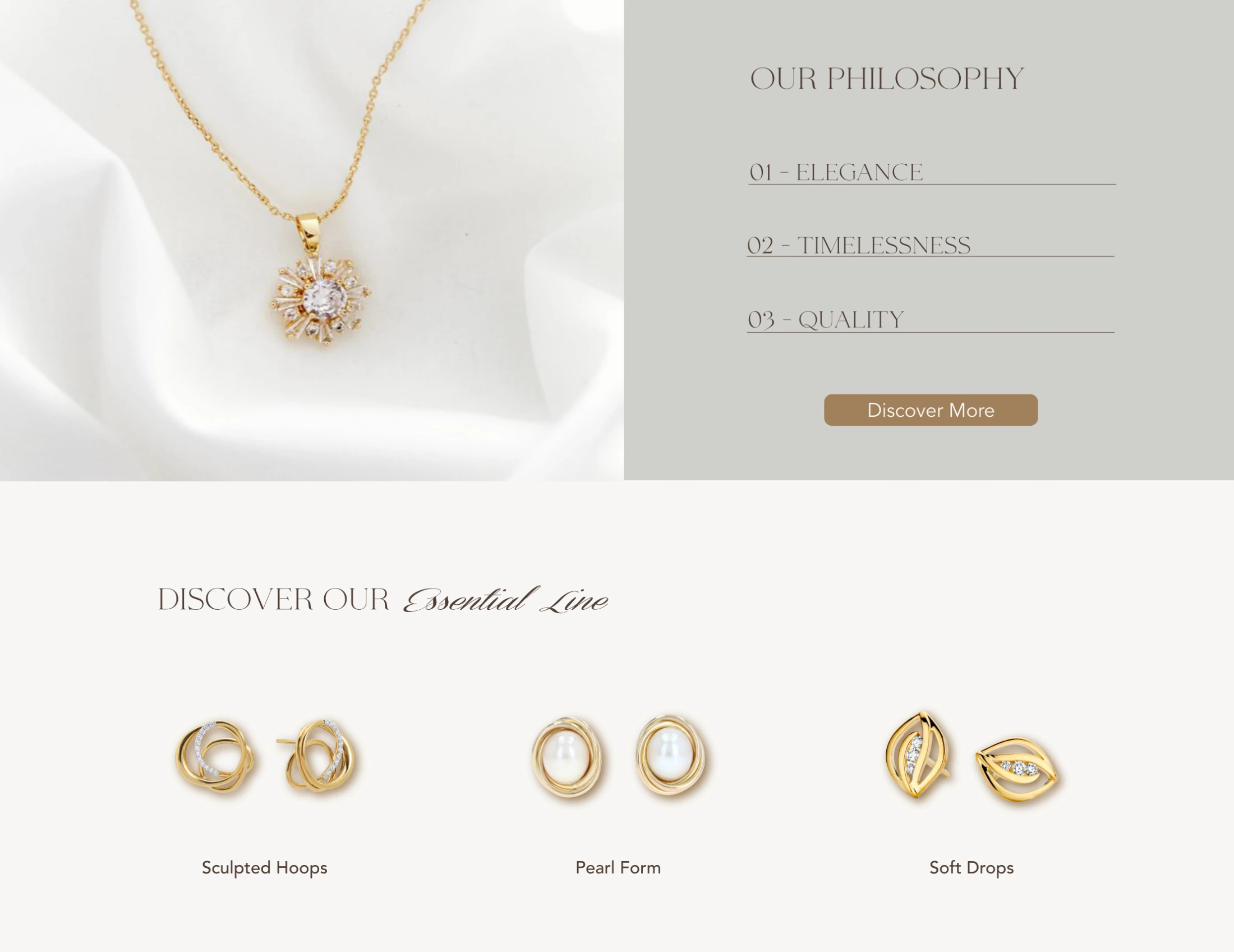
The visual identity is built around a refined wordmark, a restrained palette of warm neutrals, and carefully considered details that create a calm and cohesive brand experience. From packaging to digital applications, the identity demonstrates how Luméa’s visual language can remain consistent across different touchpoints while preserving its subtle and distinctive character.
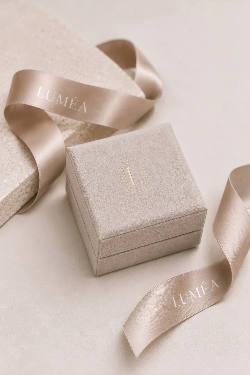
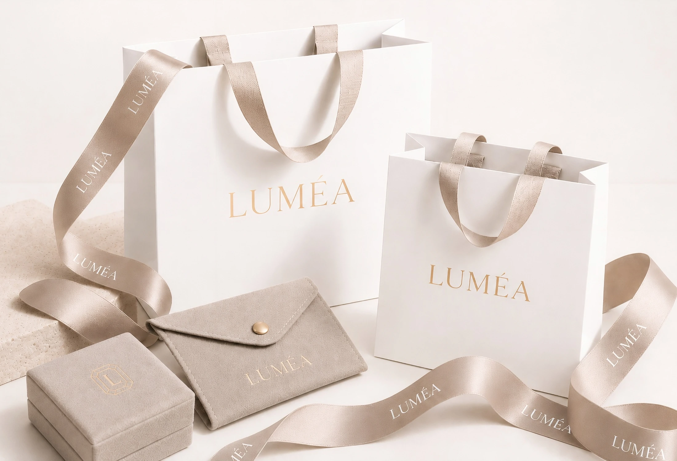
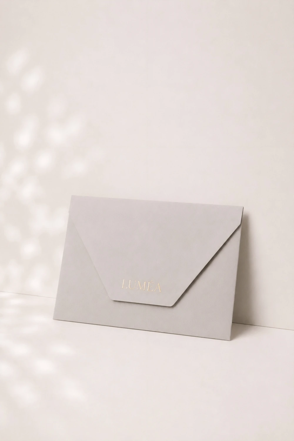
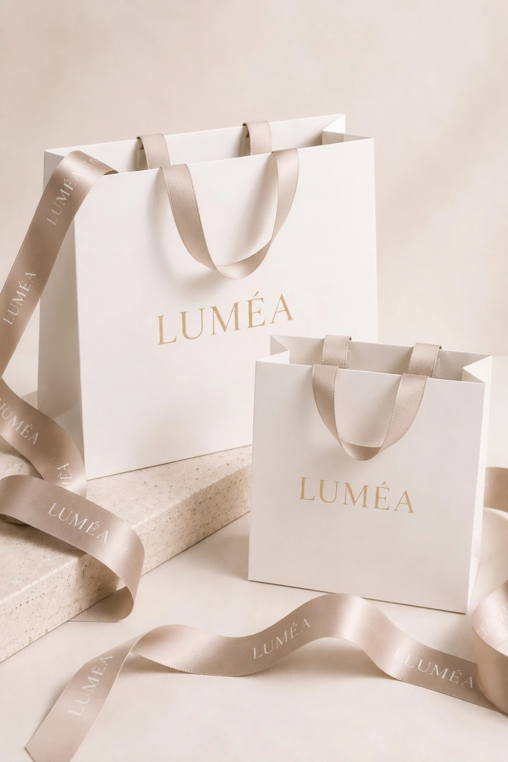
The Packaging
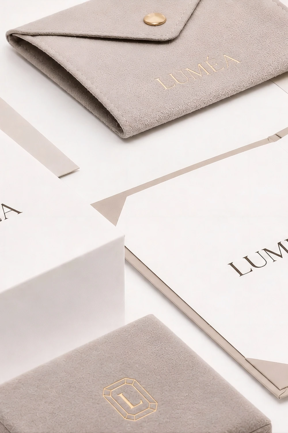
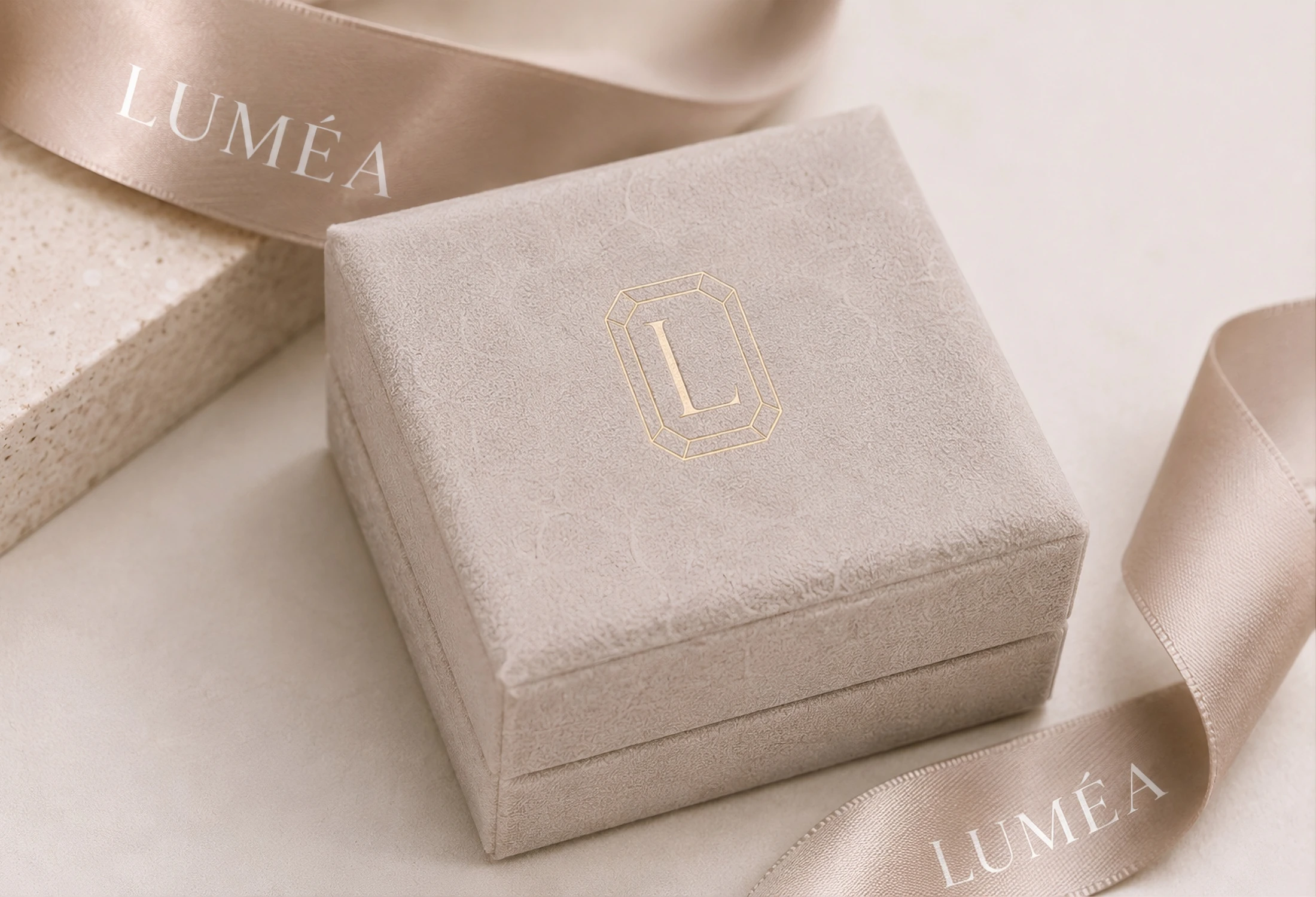
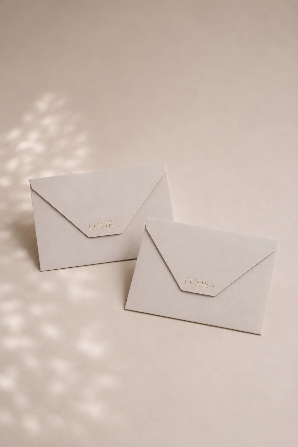
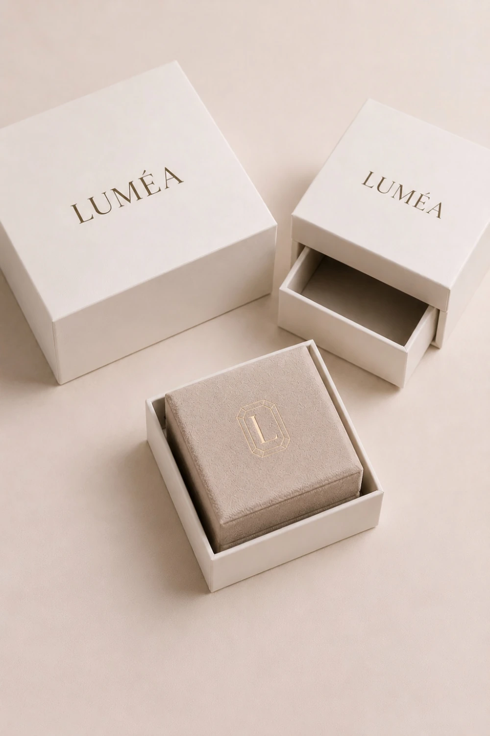
Luméa’s packaging system reflects the brand’s understated approach to luxury through subtle, considered details. Warm neutral tones, carefully selected materials, and refined gold accents create a sense of quality without excess. From jewelry boxes and gift bags to printed materials, each element is unified by a consistent visual language, creating a cohesive and recognizable brand experience.
Digital Experience
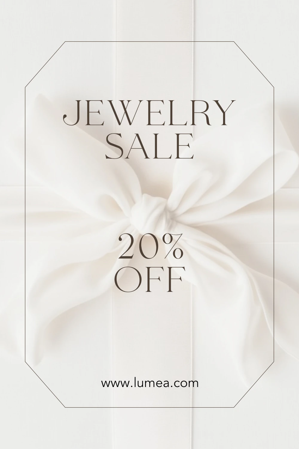
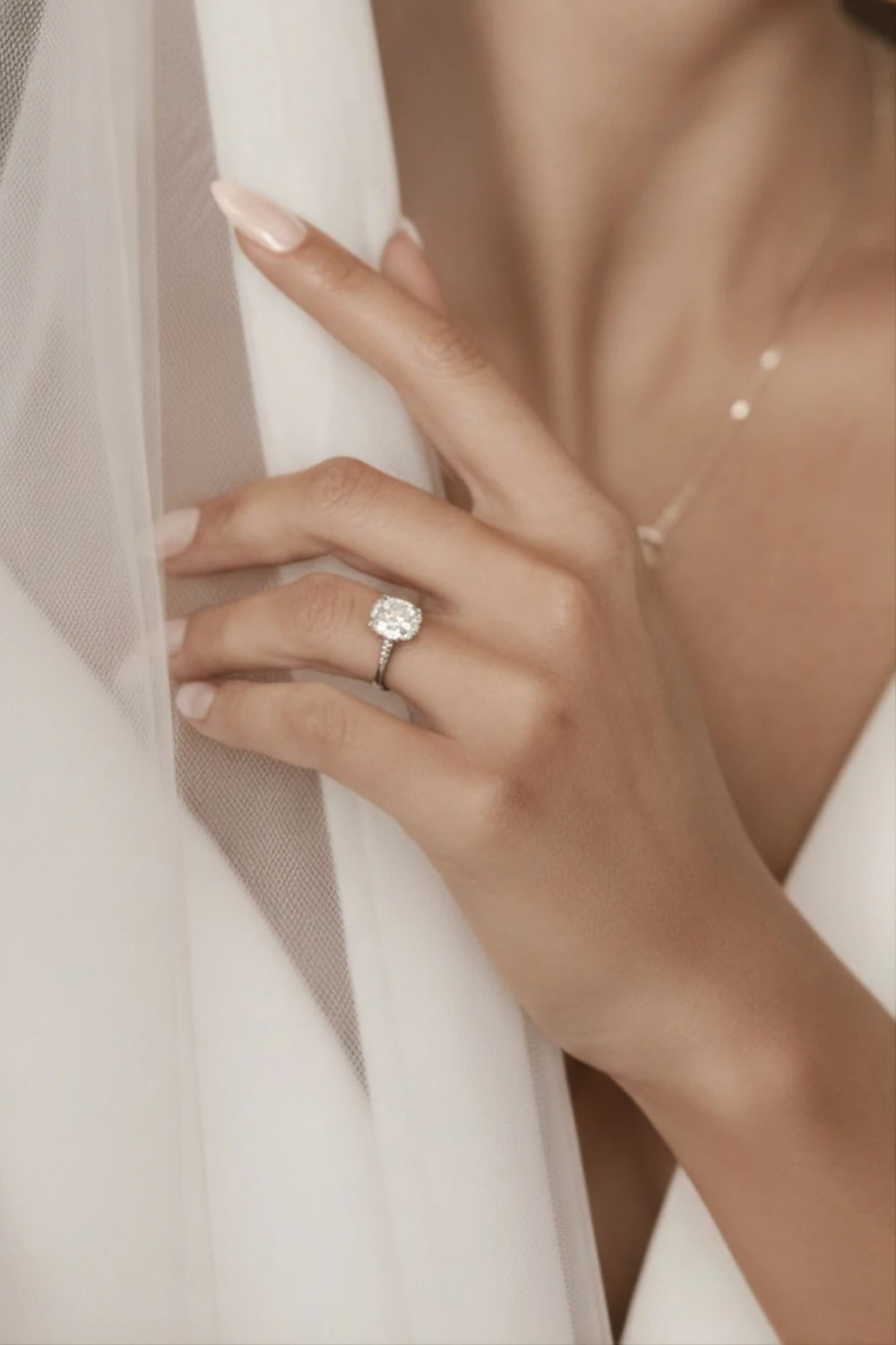
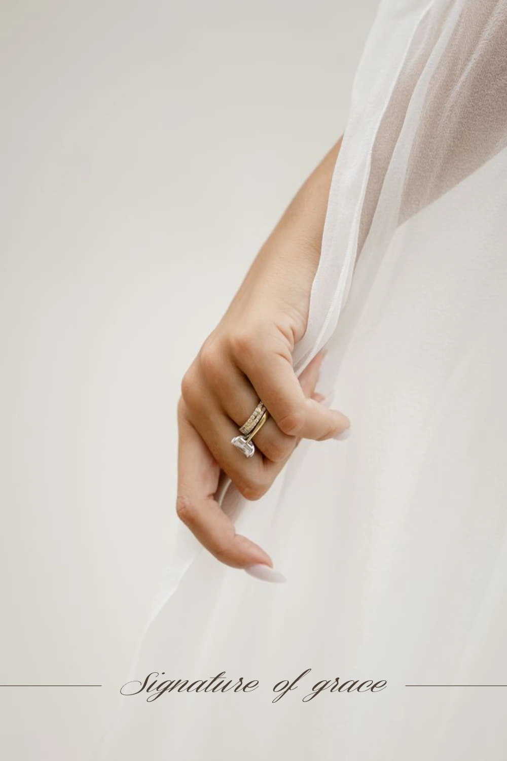
Luméa’s visual identity extends into digital touchpoints, demonstrating how the brand could translate across e-commerce and social media. Refined typography, warm neutral tones and generous use of space create a calm and cohesive digital presence, while product-focused imagery and restrained layouts keep the jewelry at the centre of the experience.